LISTEN. Bad Copy, Non-HTTPS, Stock Photography, Forced to Use The Back Button...And Many More Errors on Your Website

Or in other words, 7 ways your website is turning hot leads ice cold. Spelling out the major ones was a catchier headline.
This needs to be addressed once and for all and we can finally put the nail in the coffin on these 7 pressing website issues. There's nothing worse than someone you respect with a HORRIBLE website. Maybe someone who paid a good chunk of money for someone else to design it and still fall short of being user-friendly is a close first.
If you're here --you're smart. Let's right these wrongs, beloved.

1. It's Confusing As Hell
They land on the home page. They're confused.
Where do I read about your company?
Where can I see your work?
How do I contact you?
Either there are too many options or none at all. And that means, there is no clearly defined next step.
Which, is directly correlated to cementing your value proposition. A quick Google search will guide you to business articles about it.
What is your unique positioning?
Some call it branding these days but if you're old school, it ain't nothing but a SWOT analysis. Where it identifies your strengths, weaknesses, opportunities, and threats in business. When you fully understand what is helpful or harmful to achieving your objectives (clients or publicity) --you also operate your business in a manner that shares better messaging.
2. You're Redirecting Them to A Far Way Land
It's standard these days to highlight your social media accounts.
Of course, you want people to follow you on Facebook, Twitter, Instagram and check out your YouTube page too. Only one problem, the goal was to get them on your website, why in Sam Jack are you sending them away? You spend money on building a website to just shoo them over to platforms you don't own? As we speak, they're probably being whisked away by someone else who caught their attention on their timeline.
By all means, share your social accounts. It helps build the trust factor, as they get to know you on a more personal level (that's if you even post). Just share it AFTER you've made your introduction. Usually on a Contact page or at the end of a blog post.
3. Two Words: Stock photography
Two more words: In Moderation.
Stock photography has its place, mainly as blog post decoration. Not as who you are as a business. Pony up the money and get a few professional photos taken. *whispers* I started with a bathroom selfie. Never once did I go down the glossy road of Stock. *shivers* There is nothing authentic about it.
Share behind-the-scene photos, caricatures, fancy typography, or good ol' plain text over forced grins works too. You can judge me if you want to but my bathroom selfie with the good light won over clients and fooled even the critics.
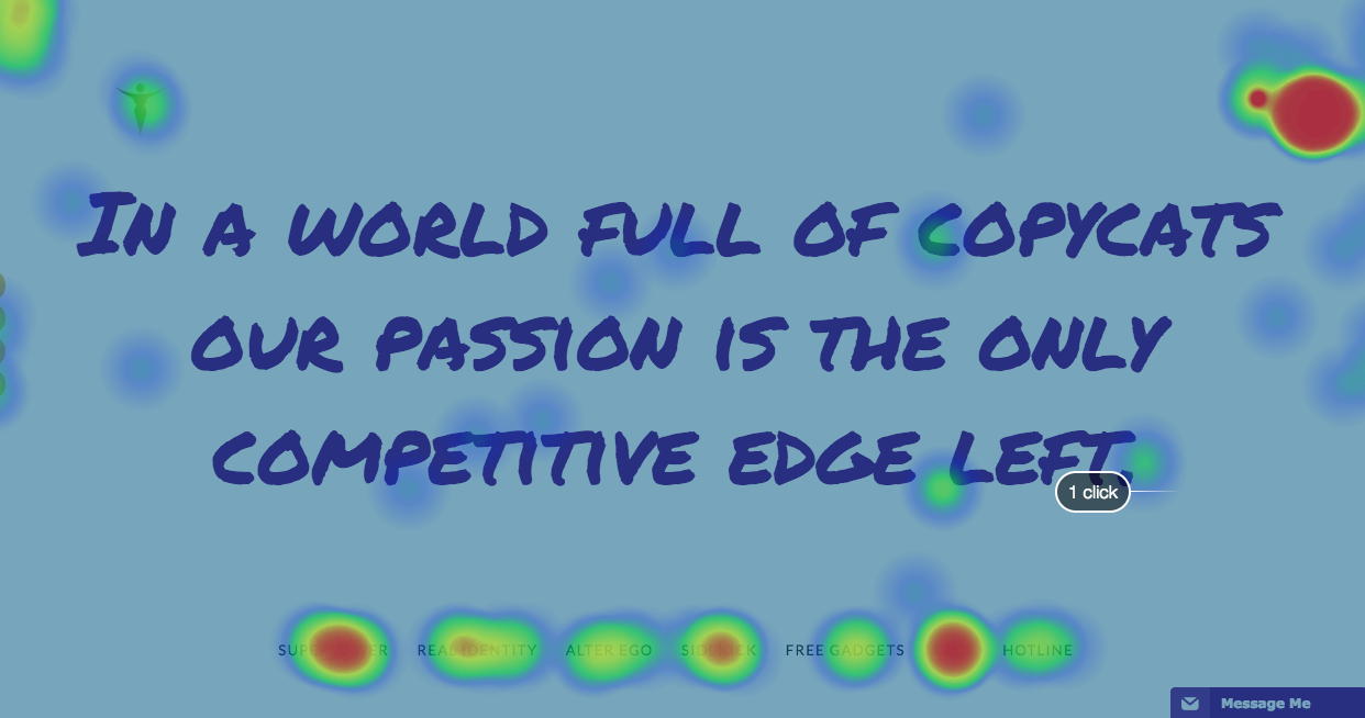
4. Well...what Do We Have On The Menu?
A whole lot of everything with a side of too much.
The maximum menu (also goes by: navigation) options you should have at a time is around 5-7. And even 7 is pushing it. Heat maps placed on my website indicate people focused on the first and last option. If given too many they're usually overwhelmed and gloss over important items. There's research on this stuff. And I also wrote about it more in this article.
5. The Good, the Bad and the No Copy
Good copy doesn't turn readers off.
It reels them in, sinking them deeper and deeper into the palm of your hand. This is what you want.
What throws them off the rails is the gawd-awful attempt at writing to everyone who lands on your website. Just so no one feels left out, huh?
Rule #1: When you talk to everyone on the internet, you reach no one. - {Click to Tweet it}
I hate to say this...but bad copy is better than no copy. Erase that last statement from your memory, once I share the one single reason that allows you to get away with it. SEO. If anything, you would have hit a few key SEO words to help you show up in search engines (here's to hoping). Before you start rejoicing, this only rings true IF you've hit keywords aligned with your industry.
Okay, the SEO thing pans out...
You got people to your website...
You still need to connect with them otherwise your bad copy will have them running for the hills. Regardless, I don't advocate either. Bad or no copy: get to know your audience and then hire some to write it if that is not your forte. *waves*
💡 Related: Want To Succeed Online?
6. A Design Deferred
Without getting too technical and staying in my lane. I've come across a few websites, when working on copy for my clients, that I've pointed out to them to get fixed by a designer.
These days we view most things from our phones. It's my dictionary, calculator, and jukebox. I whip it out when I want to try a new restaurant and snoop the reviews. Or when I need the translation of "Where can I find the bathroom" in Spanish. Which leads me here...
Your website MUST BE Mobile-friendly. This is not a drill.
Neither I or customers have the patience for a molasses website. You're losing people by the millisecond. Have you ever been on a website that wasn't mobile friendly? It's all cluttered and jumbled up. The site doesn't render probably. It needs to be a seamless transition from a social network to your website. If it's not, you'll be Googling "Where can I find clients" in all languages.
Next, broken links.
I see this so often I want to start a petition #FixTheLinks. Especially when social media accounts are proudly displayed and the only action it prompts is to refresh the current page #FixTheLinks. Double check that your important buttons are working. Don't think people will try to figure it out. They won't #FixTheLinks. Try this Broken Link checker or I'll tell you a hack in the final point if you don't end-up catching all of the broken links and you ain’t got time for all that.

Non-HTTPS (HyperText Transfer Protocol Secure).
It's coming down the wire this month. Google is putting a big fat DO NOT ENTER red marker across your website if it's not secure (ex. https://www.sheisepic.com) . Not too long ago, you could get away with just having a HTTP web address if you weren't selling any goods that required a credit card. Now, it's deemed unsafe for visitors. Safe websites tote an image of a secure pad lock. *Looks above to the web browser bar*. If you don't want to scare off potential buyers and turn hot leads ice cold this could be the deal breaker. This article shares how you can tell your web developer to fix it.
Last one. URLs that don't open a new tab. *pulls out eyebrows*
This is more of a pet peeve but if I'm anything like your potential client, it probably bugs them too. If I'm already on your website don't allow me to click an external link to leave your website. Have that bad boy open up in a new tab.
Here's the set-up: I am reading an article you wrote and you reference a source. I click on the link and it whisks me away to a far way land.
Unless that article was hella compelling, neither I or they are hitting the back button.
You made it too easy to leave. Make it too easy to stay.
7. What's The 404?
The final point on this list is often left to fend for itself.
It's an important aspect usually overlooked but many of your website visitors have already landed on this page at least once. Broken links happen sometimes. Buttons don't work properly the other times. You need to plan for all of those times by customizing your Oops! page.
This can either be a wasteland where people go and never return or it can redirect them to where they originally wanted to be.
You get to decide.
Share a pressing website issue you ran into in the comments?